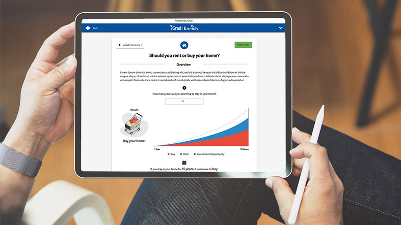
The scholarship search tool was the #8 ranked page on iGrad and Enrich in 2020. Because it's this valuable, I conducted a variety of product analysis methods on it with the goal of identifying opportunities to improve and enhance the tool.
Recommendations as a result of research process:
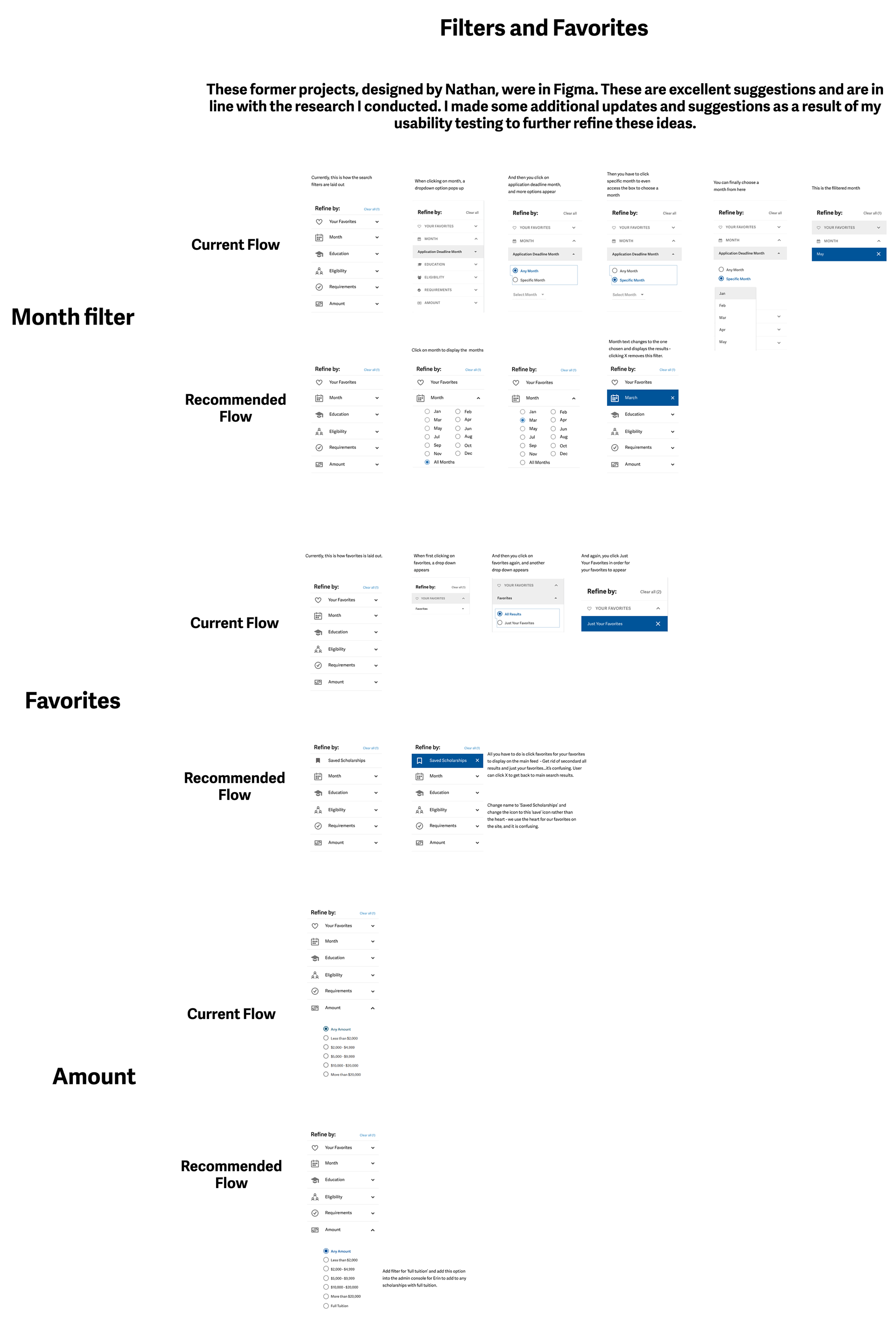
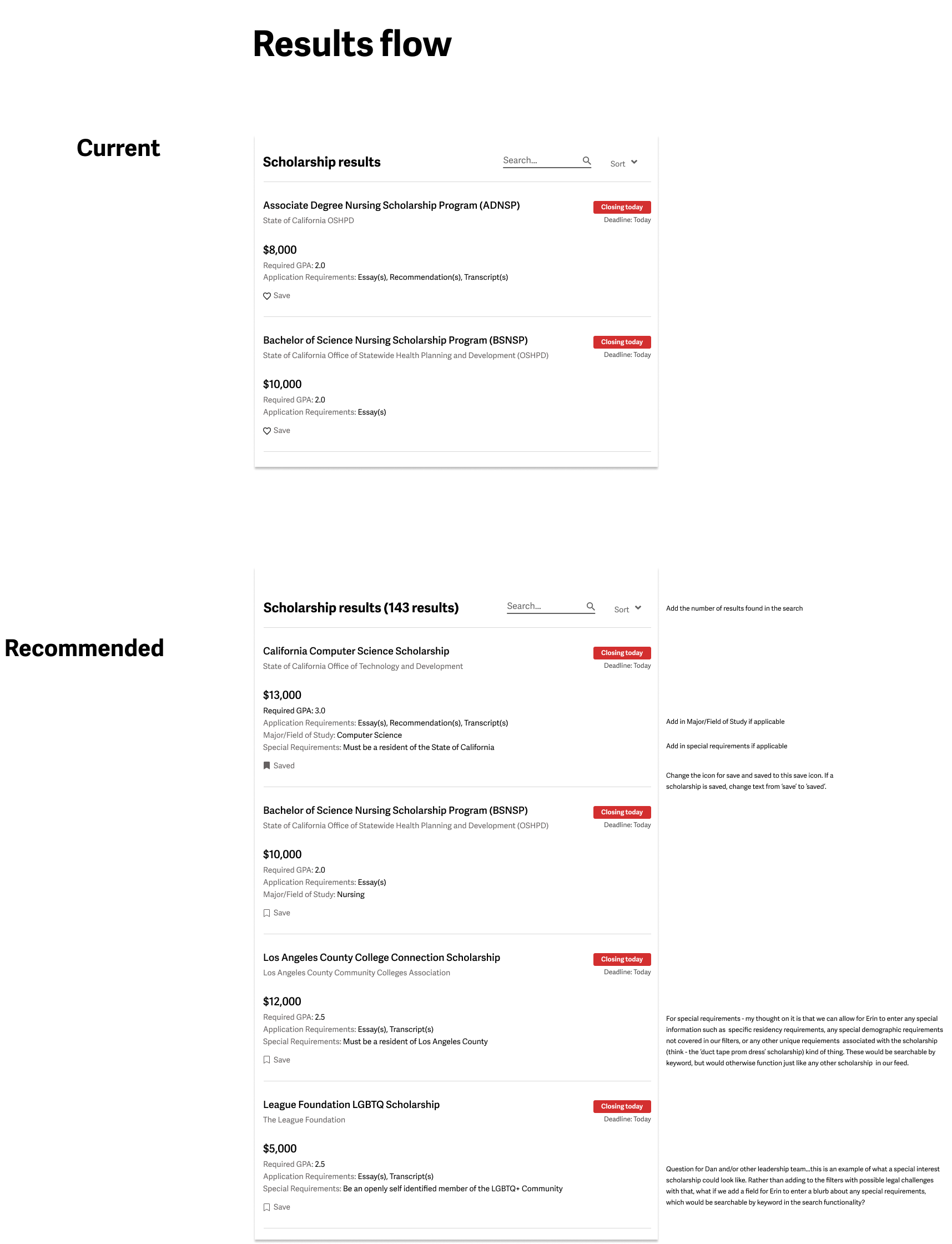
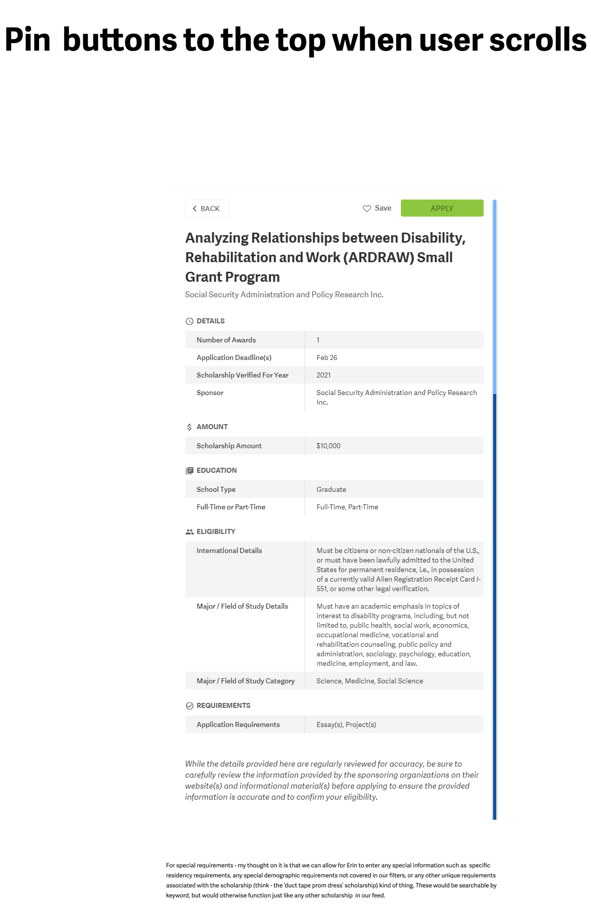
Based on the research I conducted, my first steps were to create a rainbow spreadsheet in order to organize and review recommended changes to the page with the Product Manager. Here is what that looks like, as well as some details on my recommended design updates:
next steps - plans for more extensive re-design:
While the above recommendations were submitted to the development team to update, the next steps were to sketch out some ideas for more extensive updates to the page for a later release. Here are some of those initial sketches:
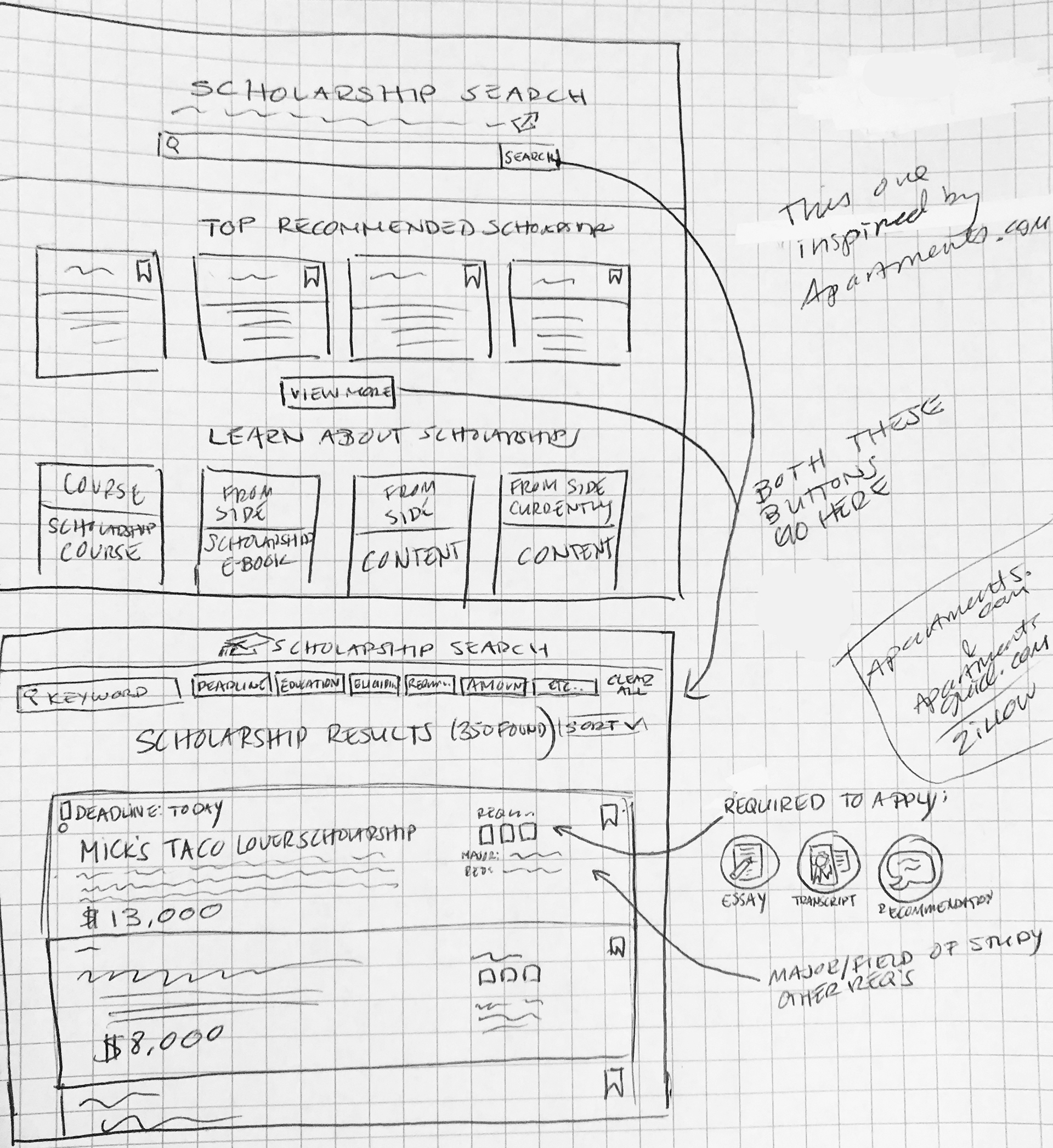
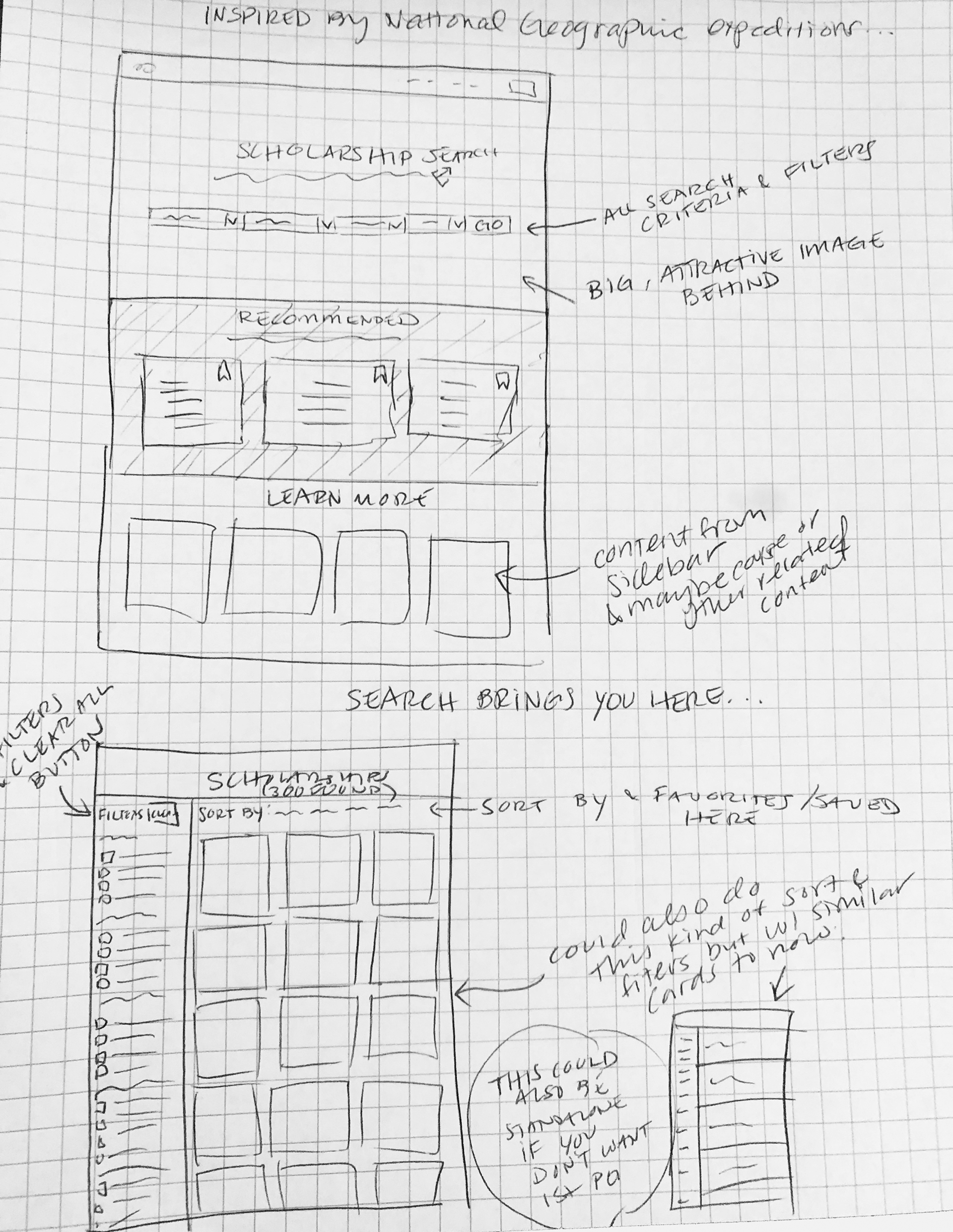
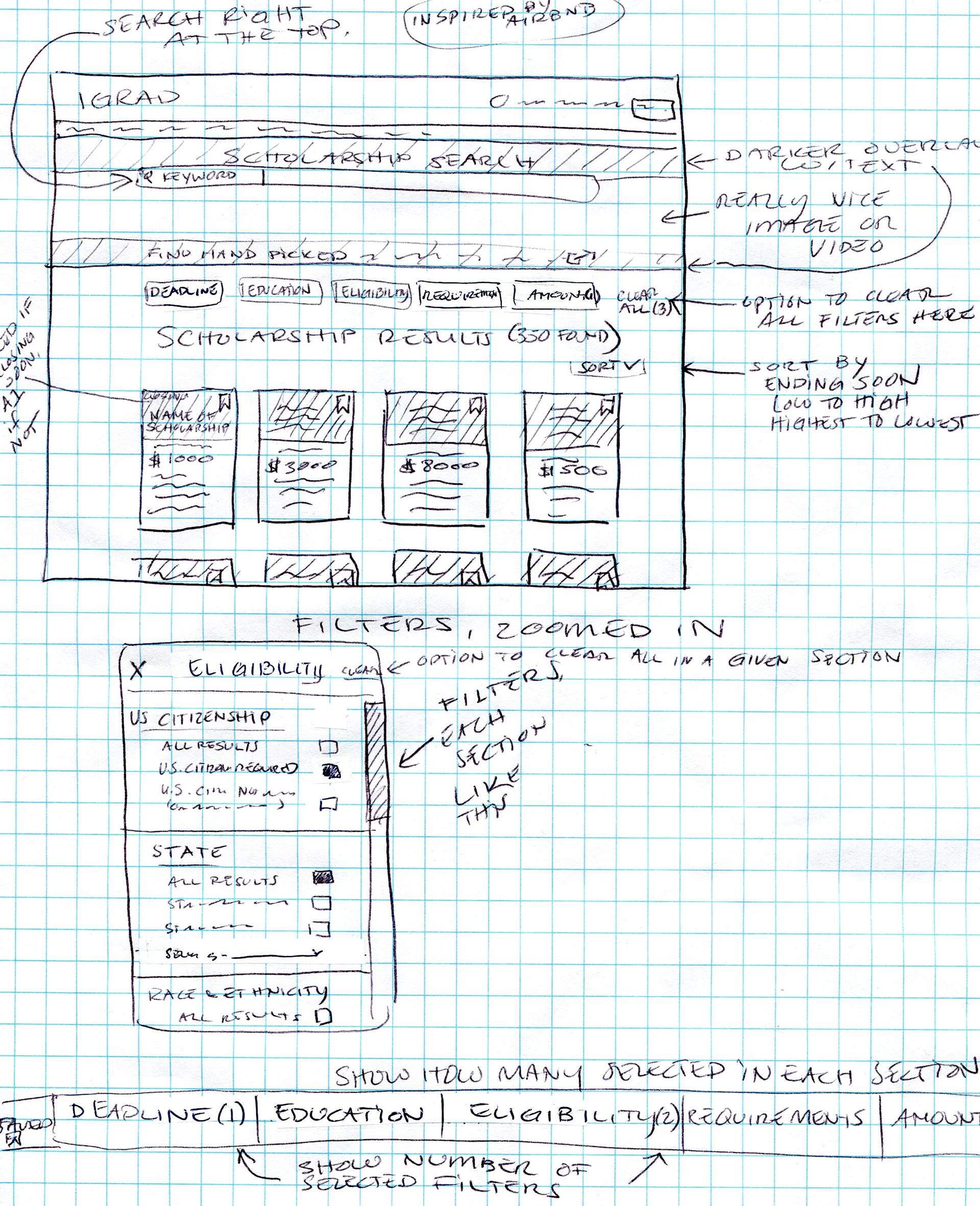
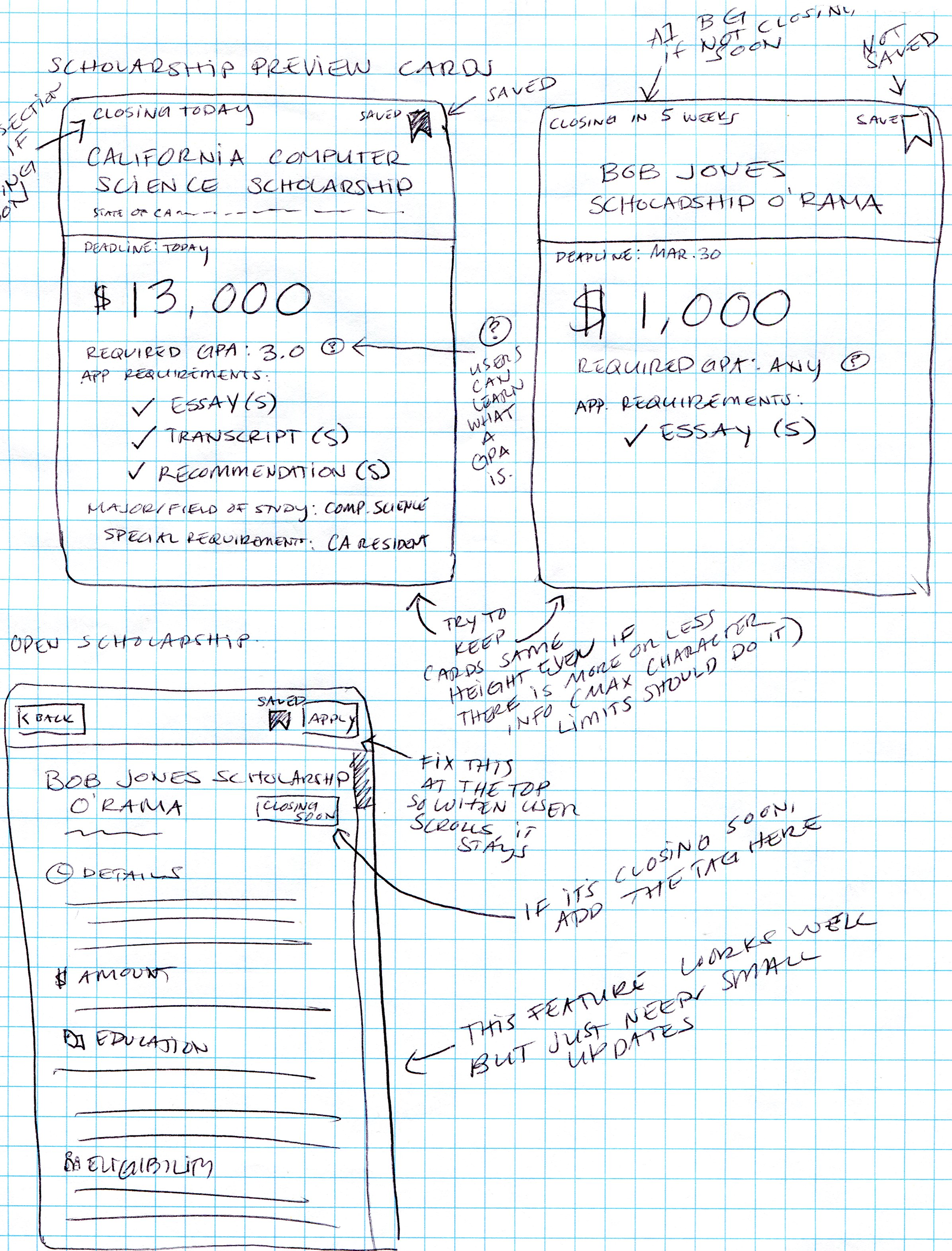
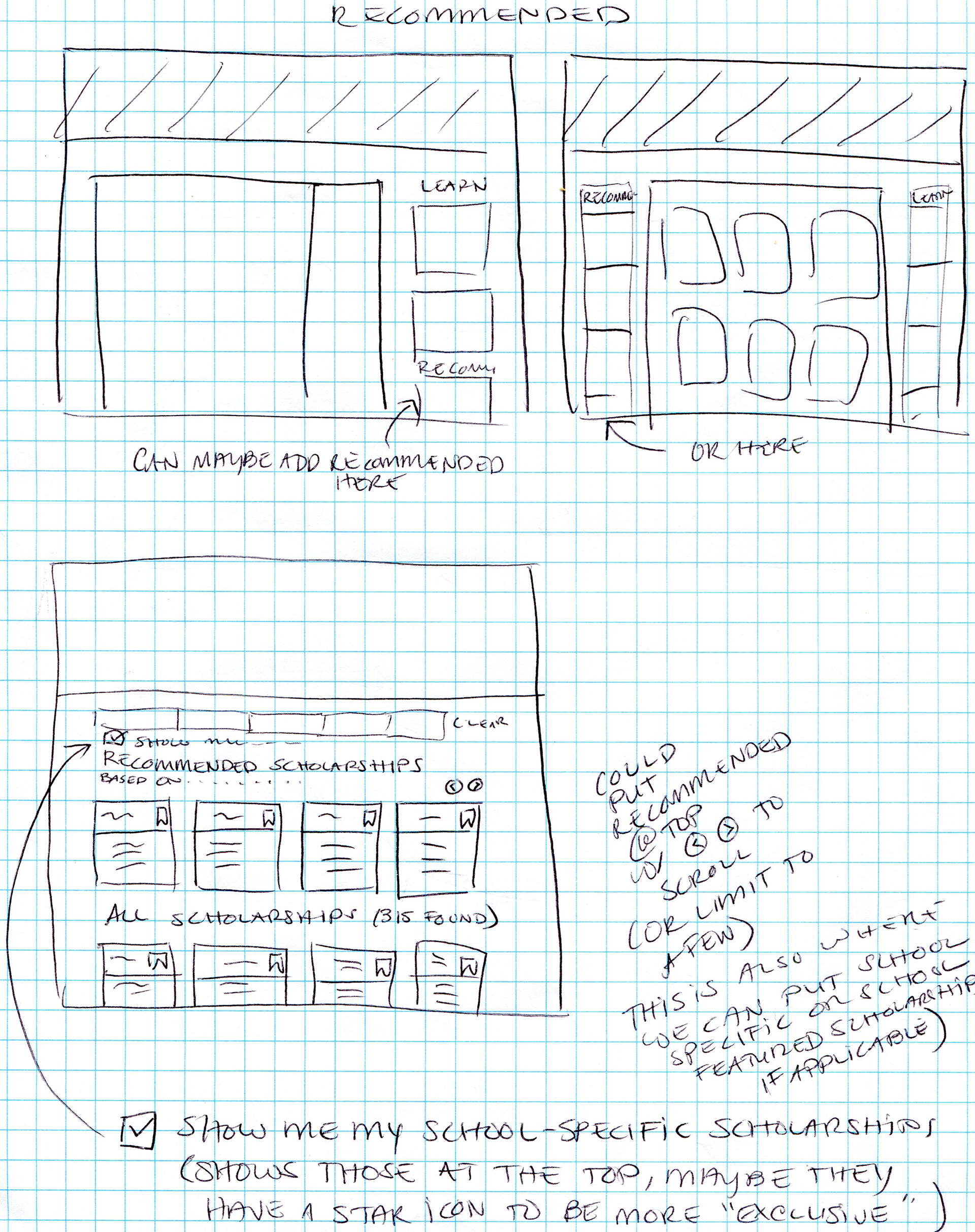
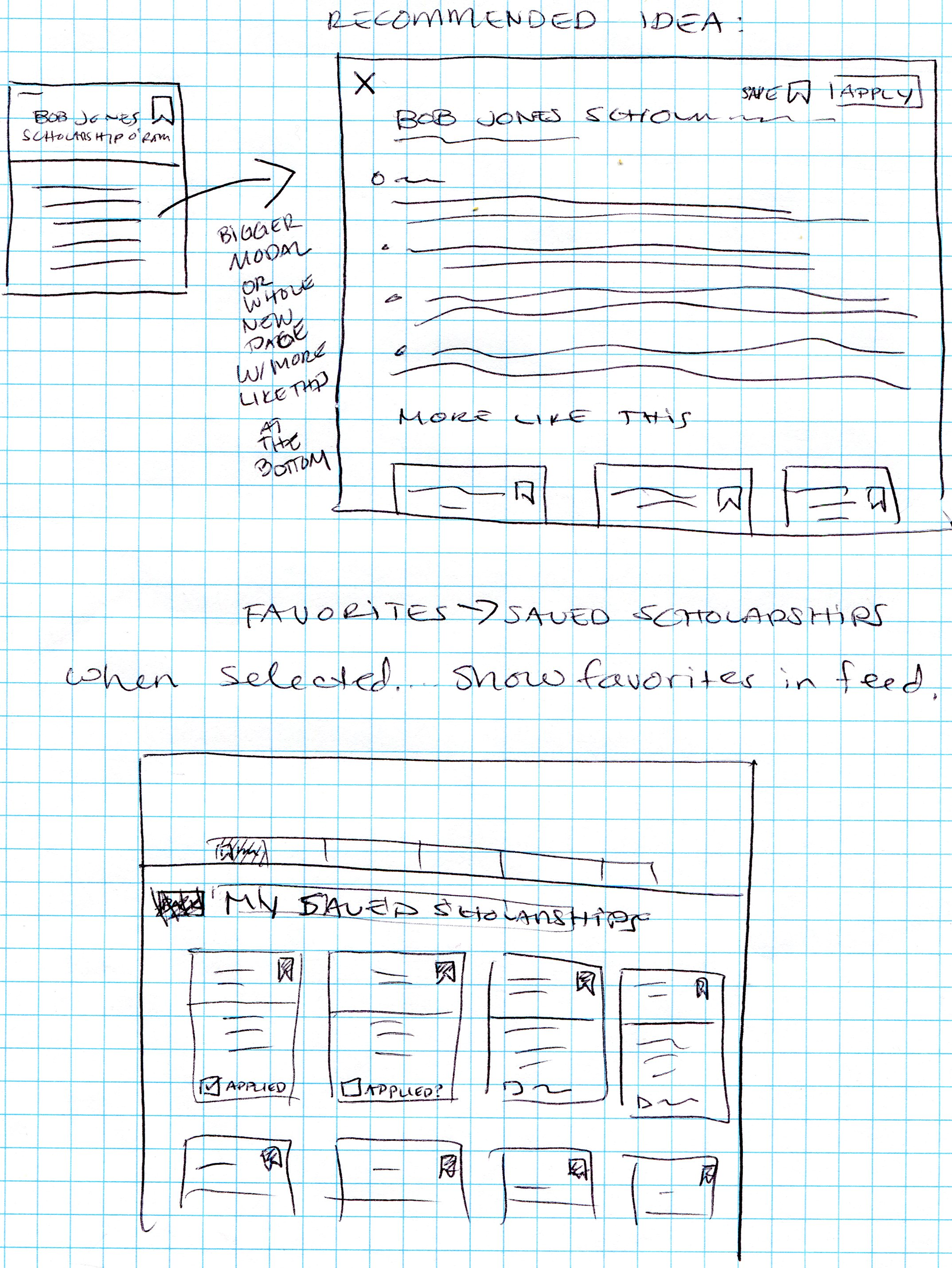
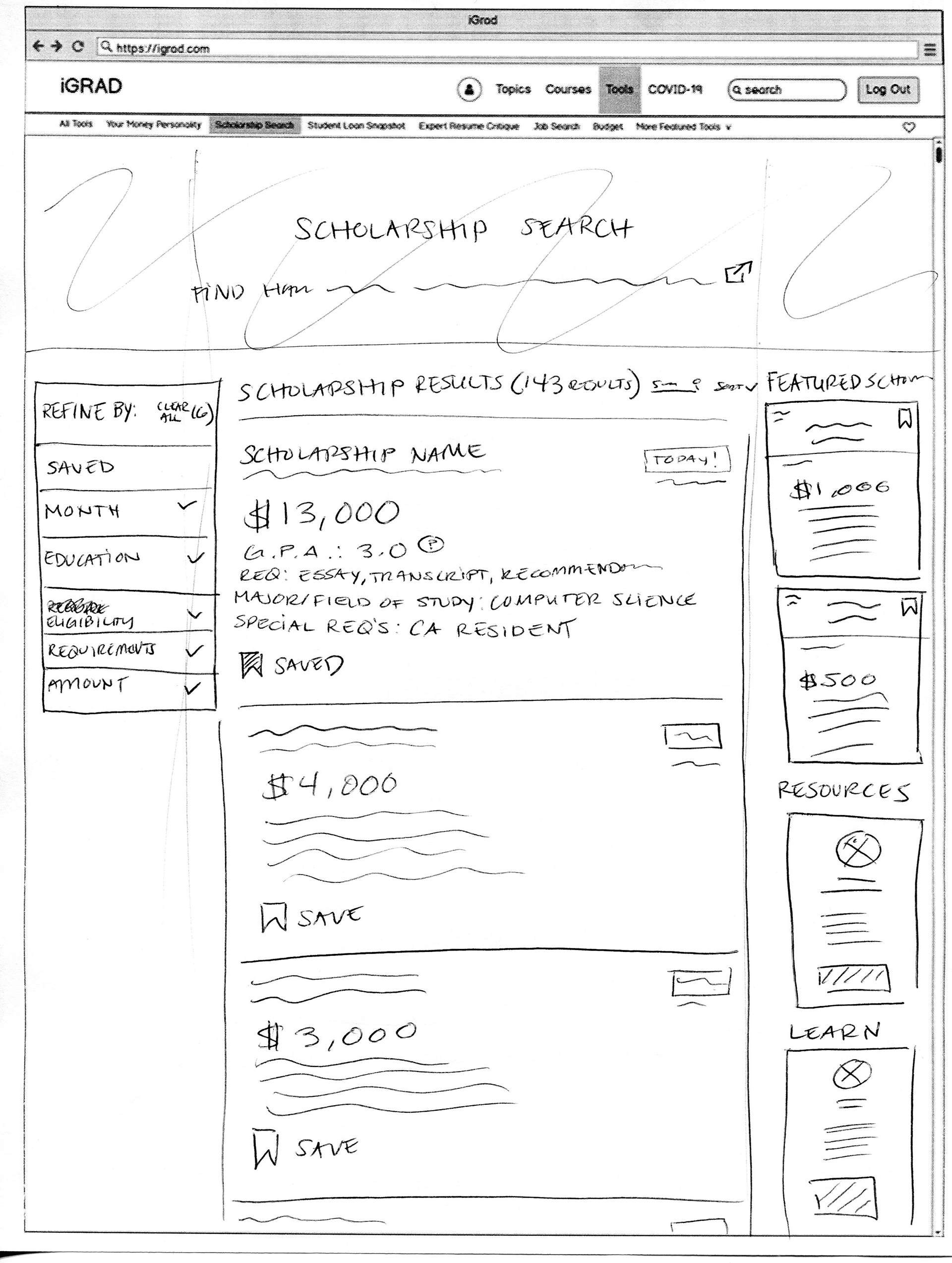
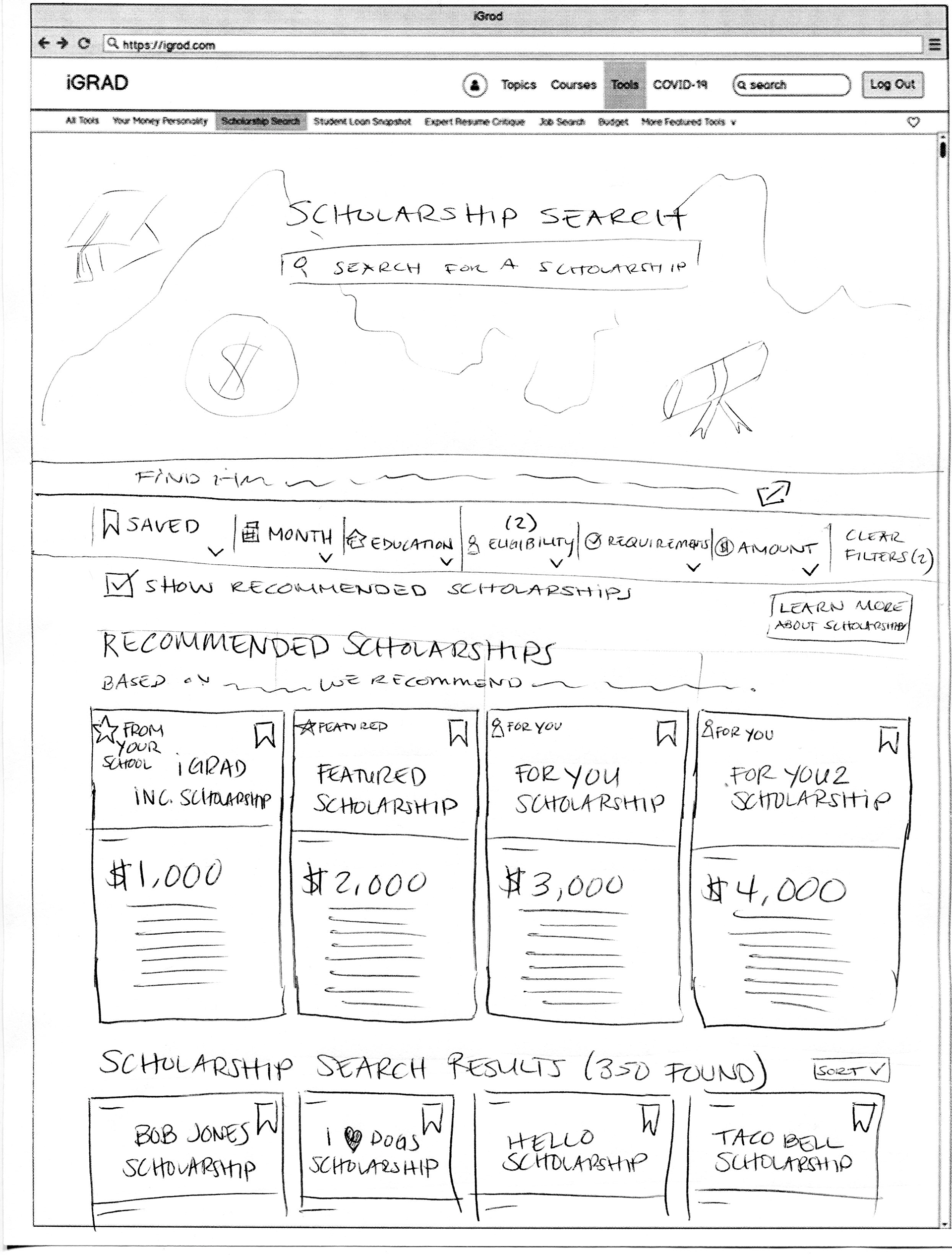
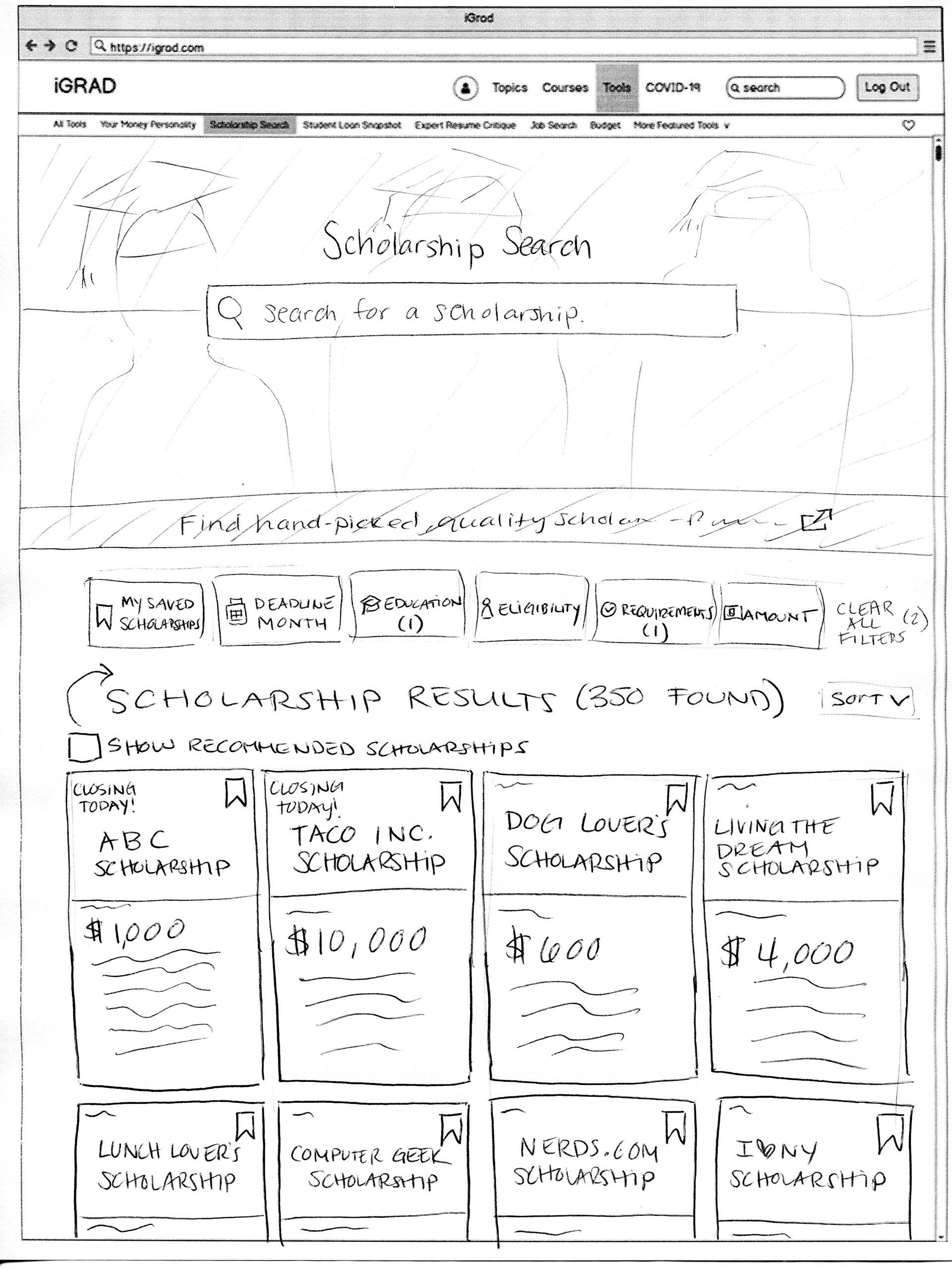
refining those sketches:
After discussing the wireframes with the Product Manager, the next steps were to refine the designs a little more in order to explore the ideas. Although these may look higher fidelity, these were quickly put together using our design system in Figma.
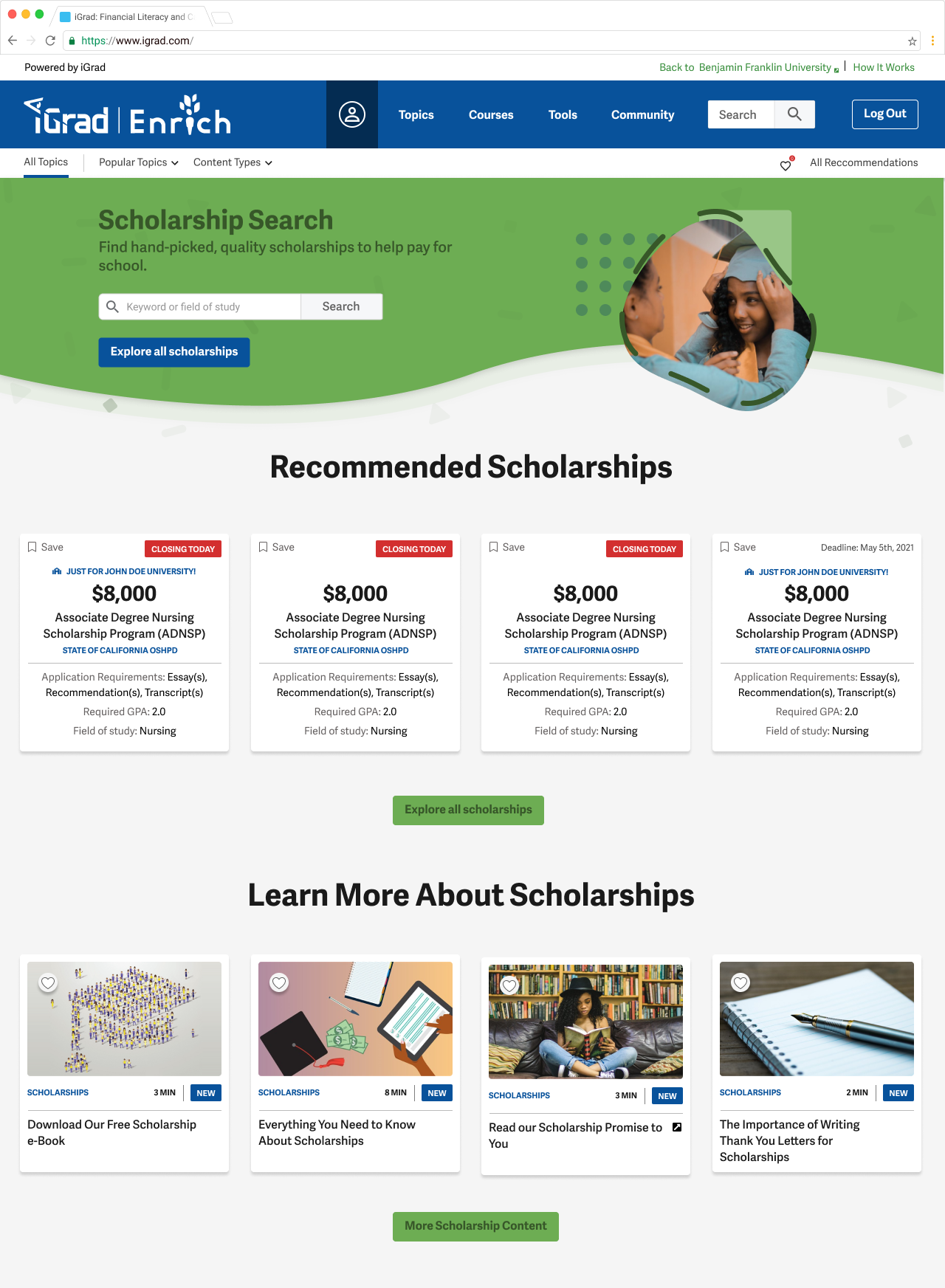
Designs for scholarships landing page - first iteration:
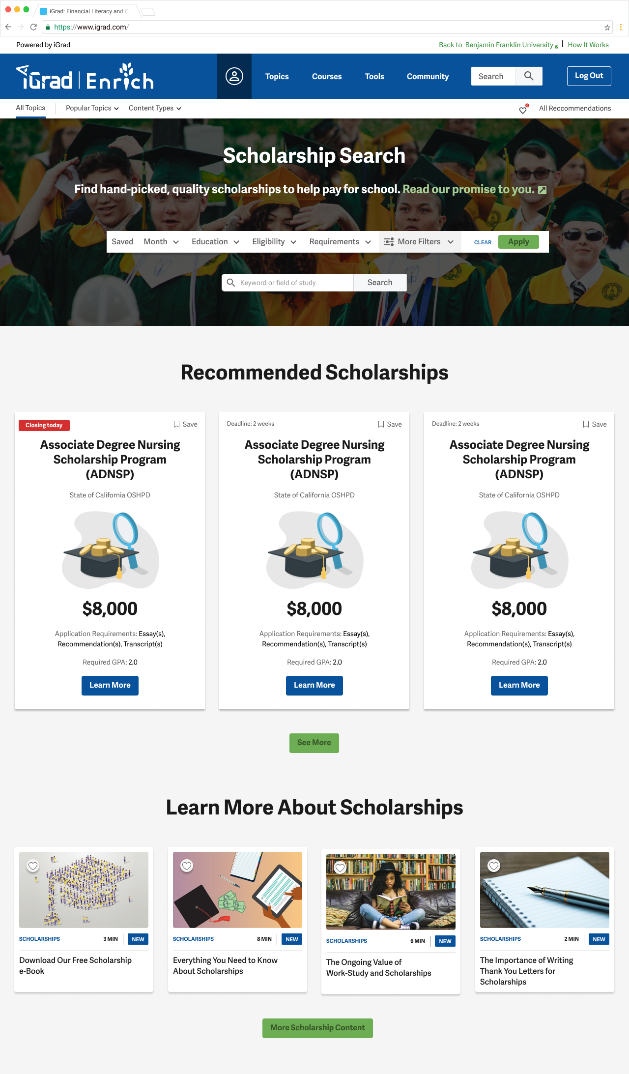
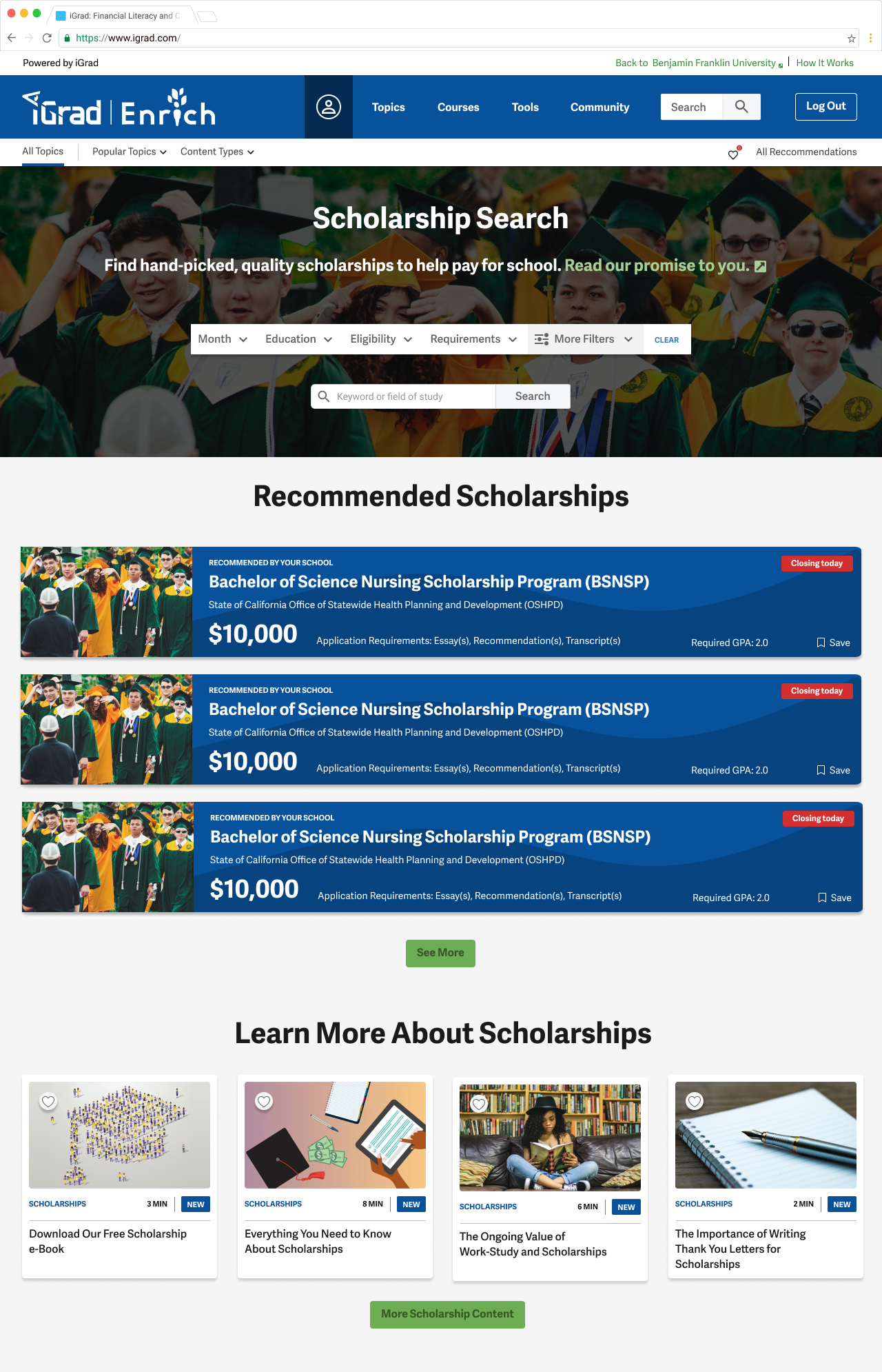
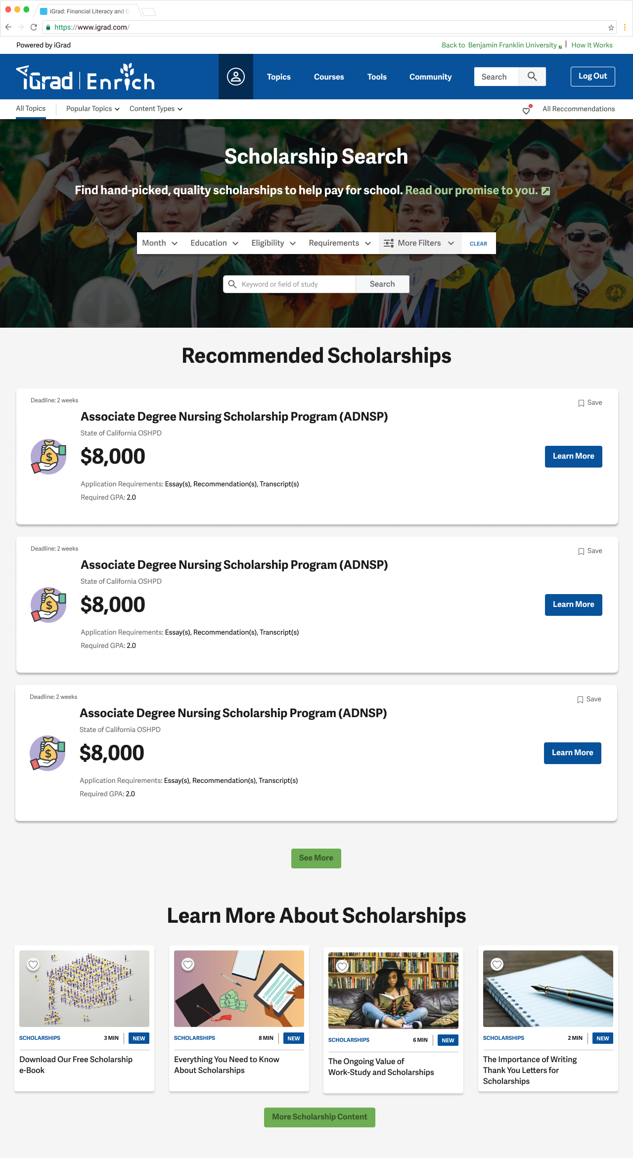
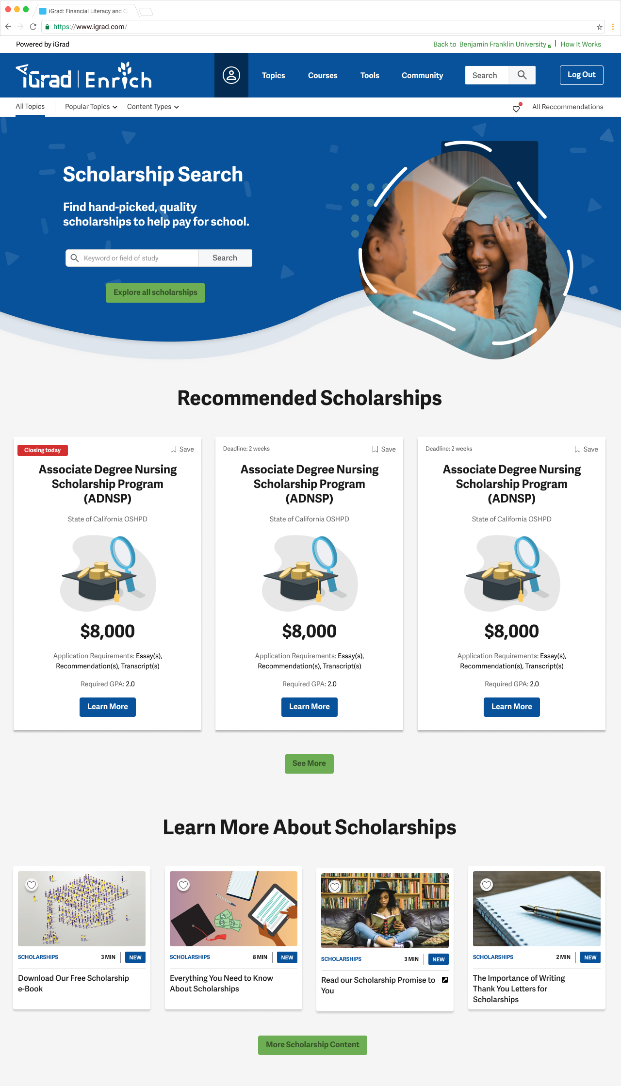
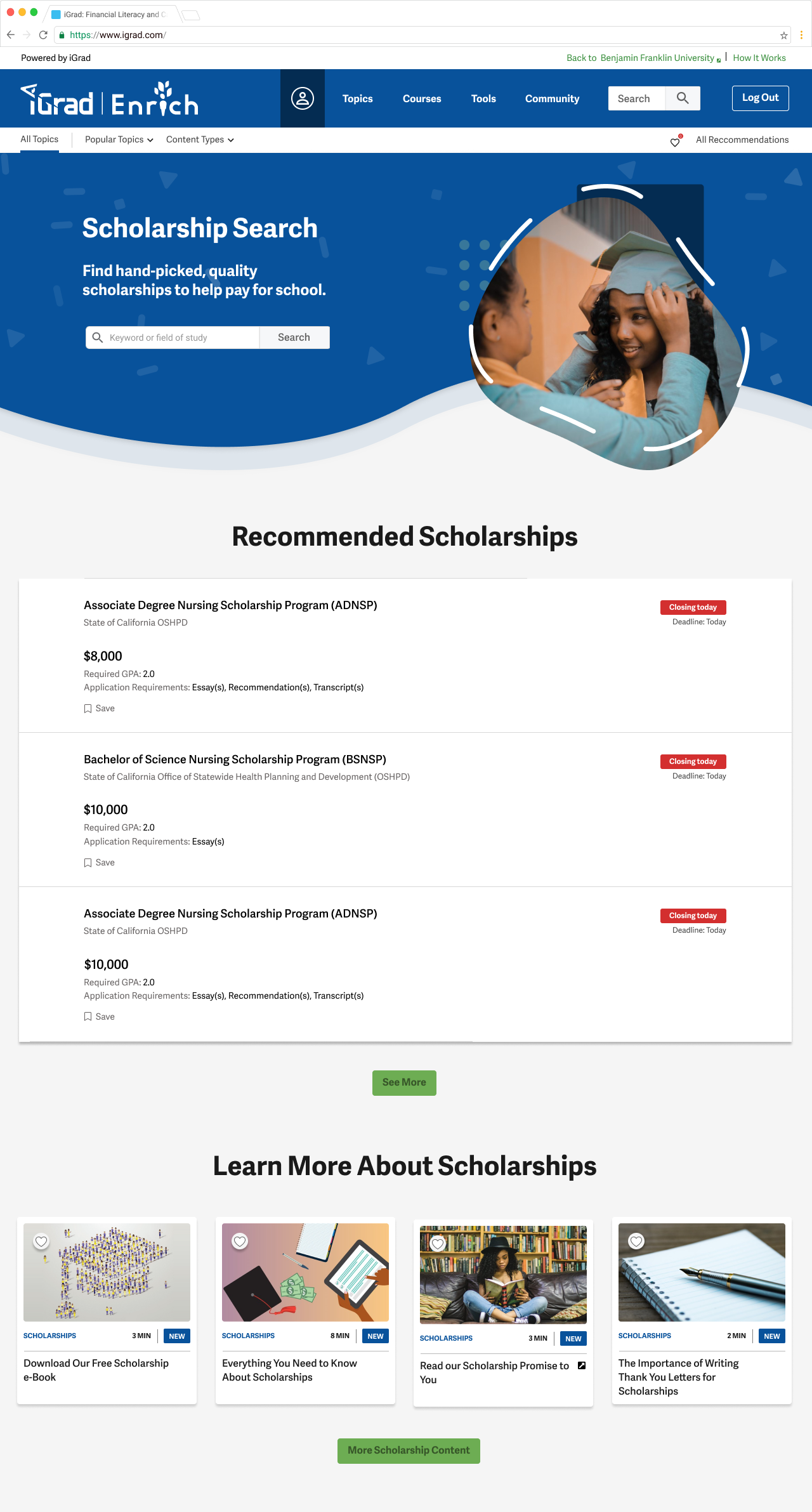
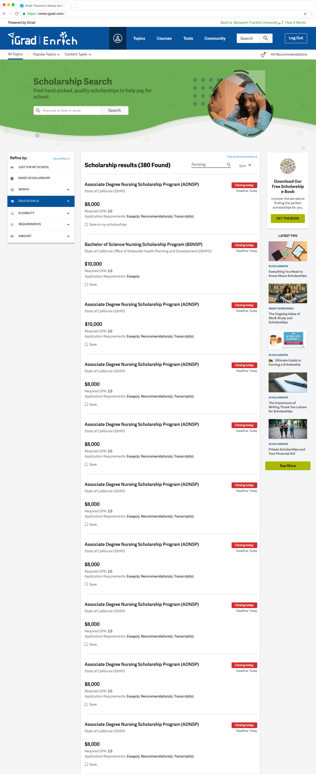
Designs for scholarships main feed- first iteration:
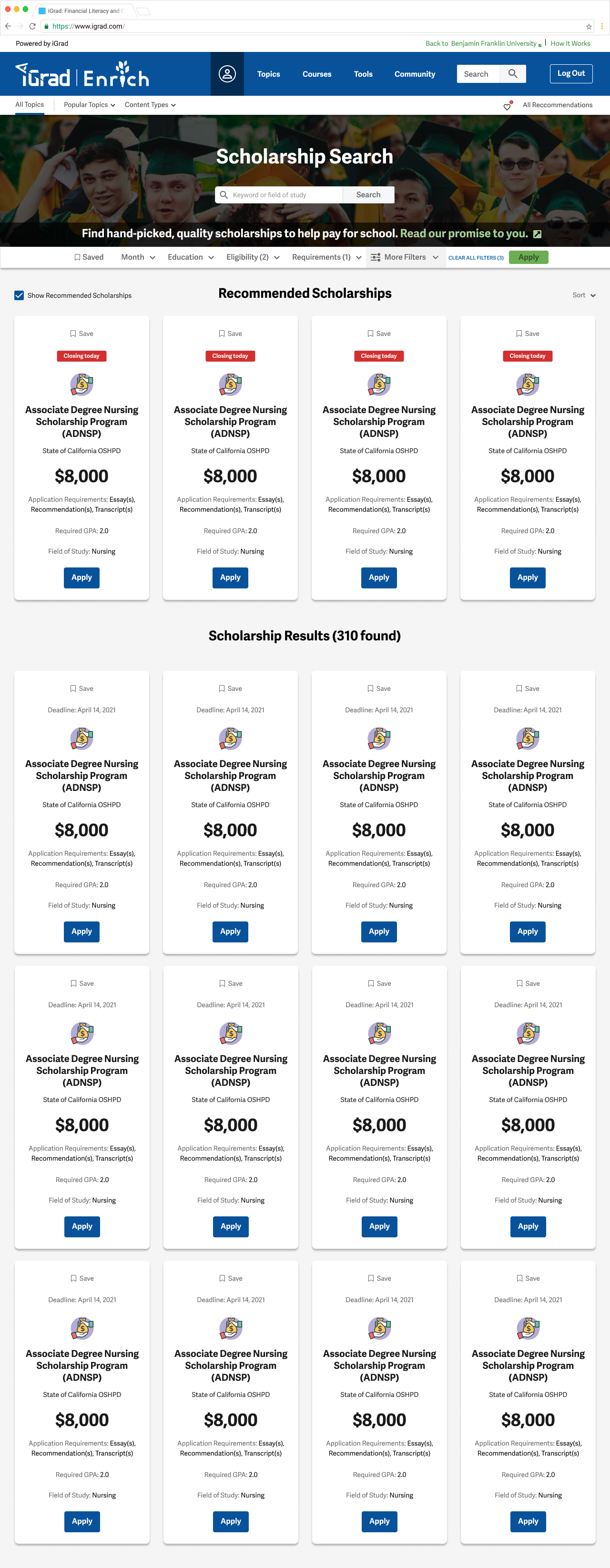
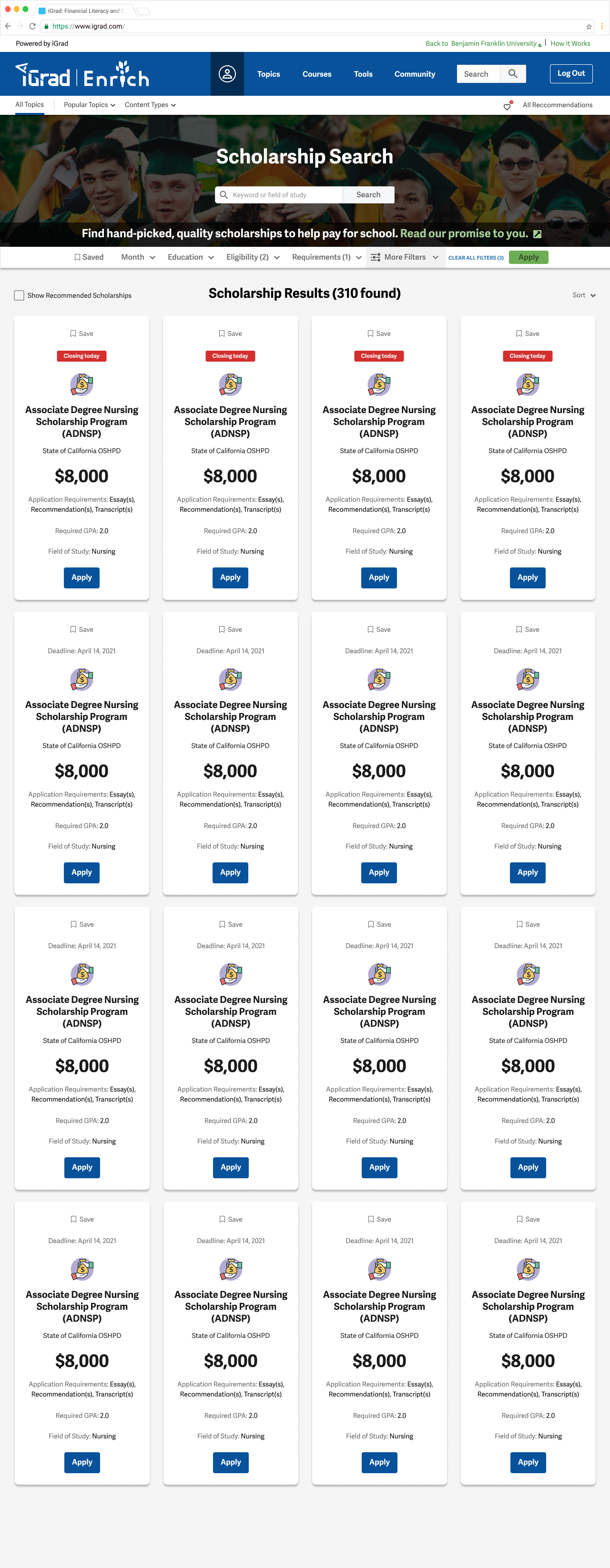
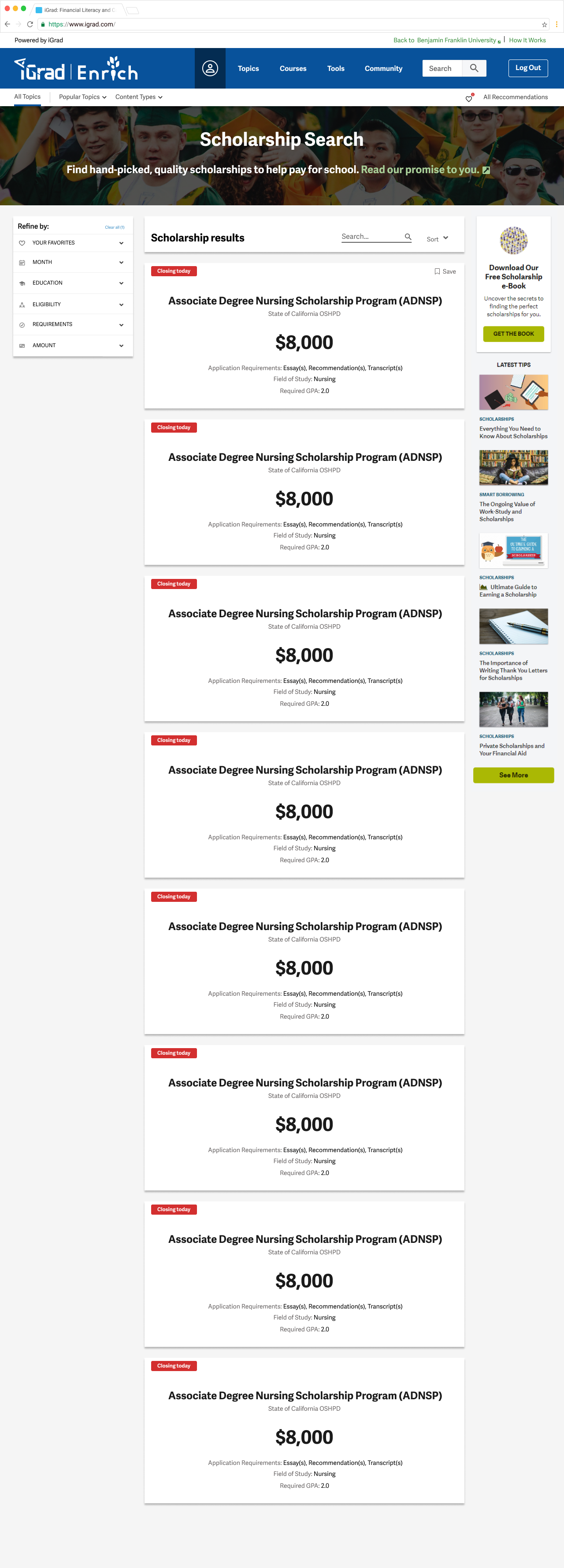
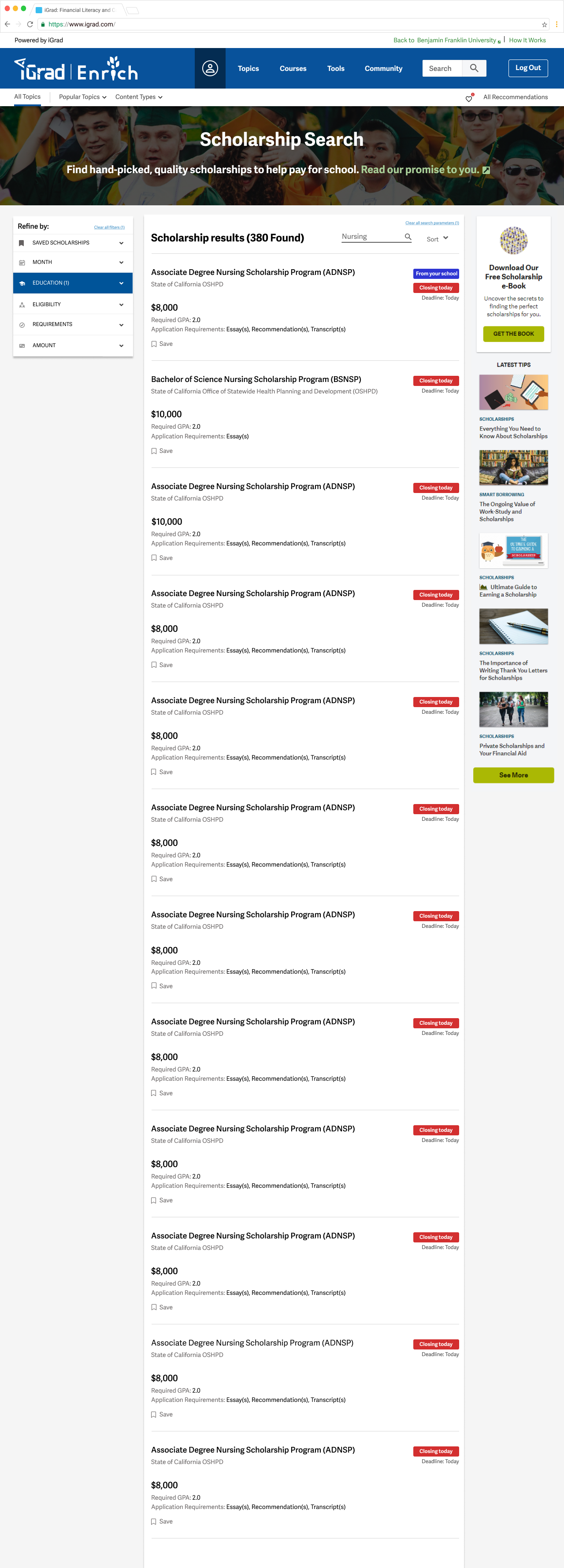
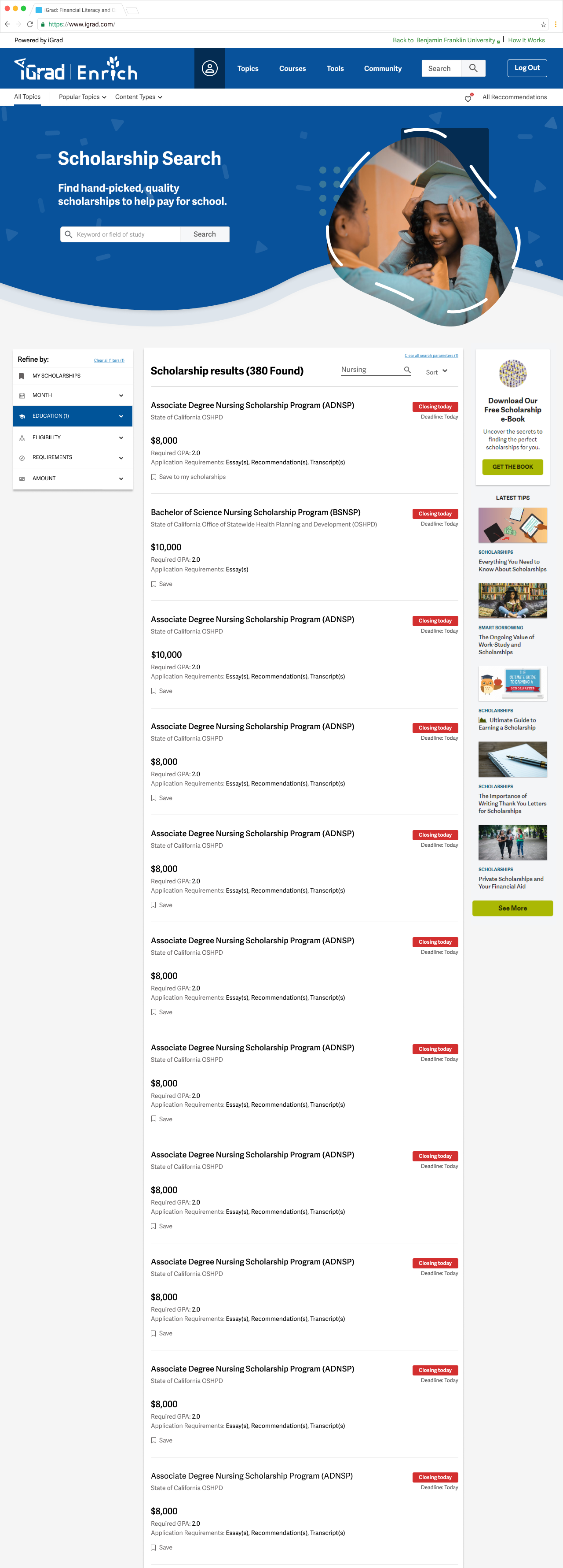
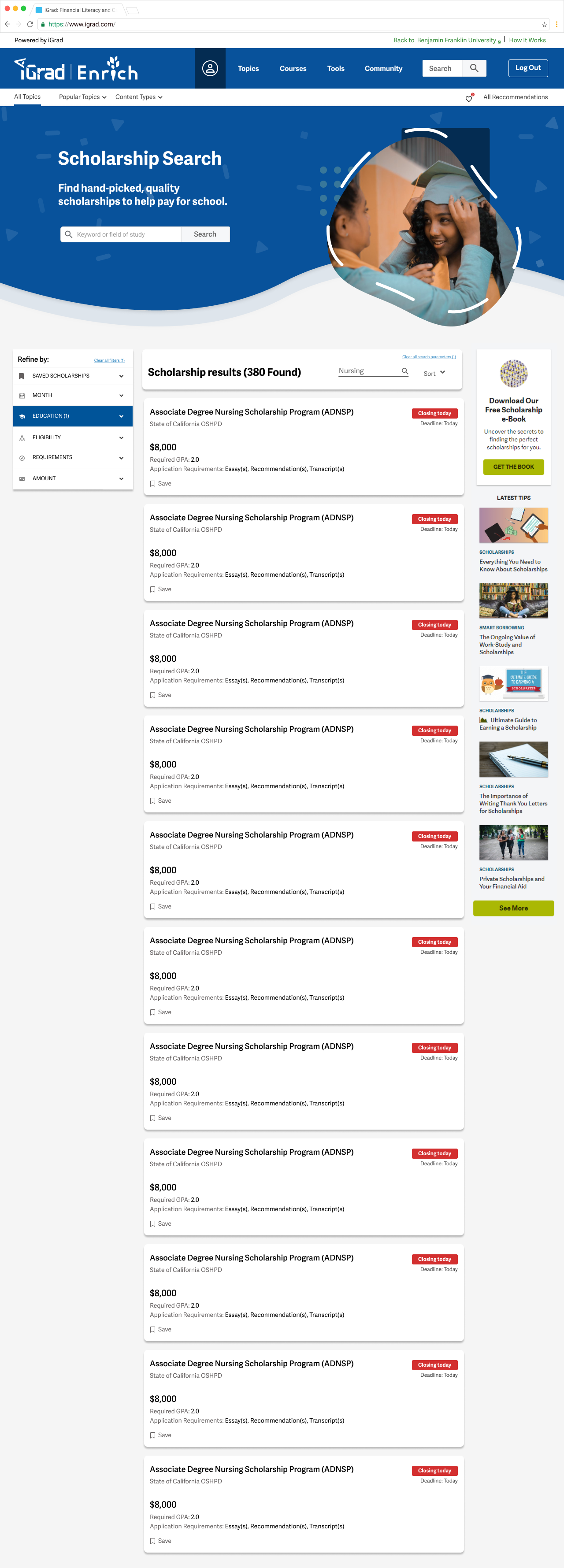
second iteration scholarships pages:
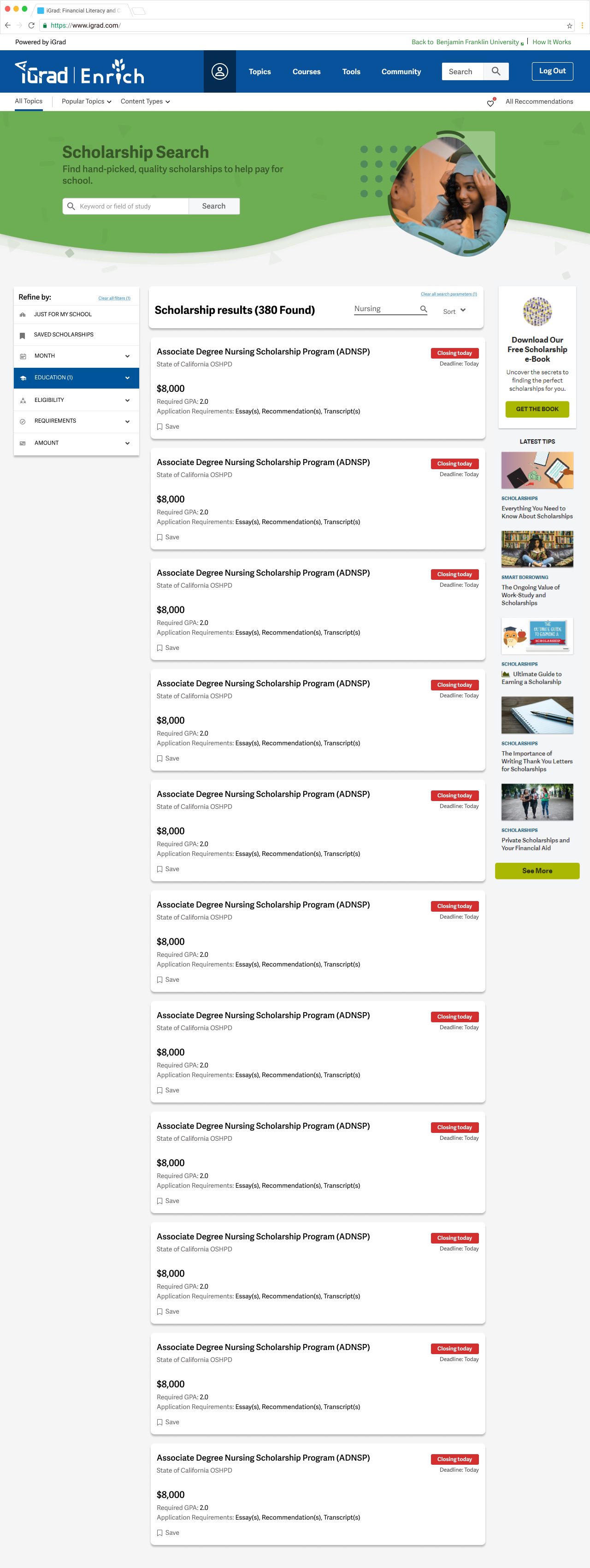
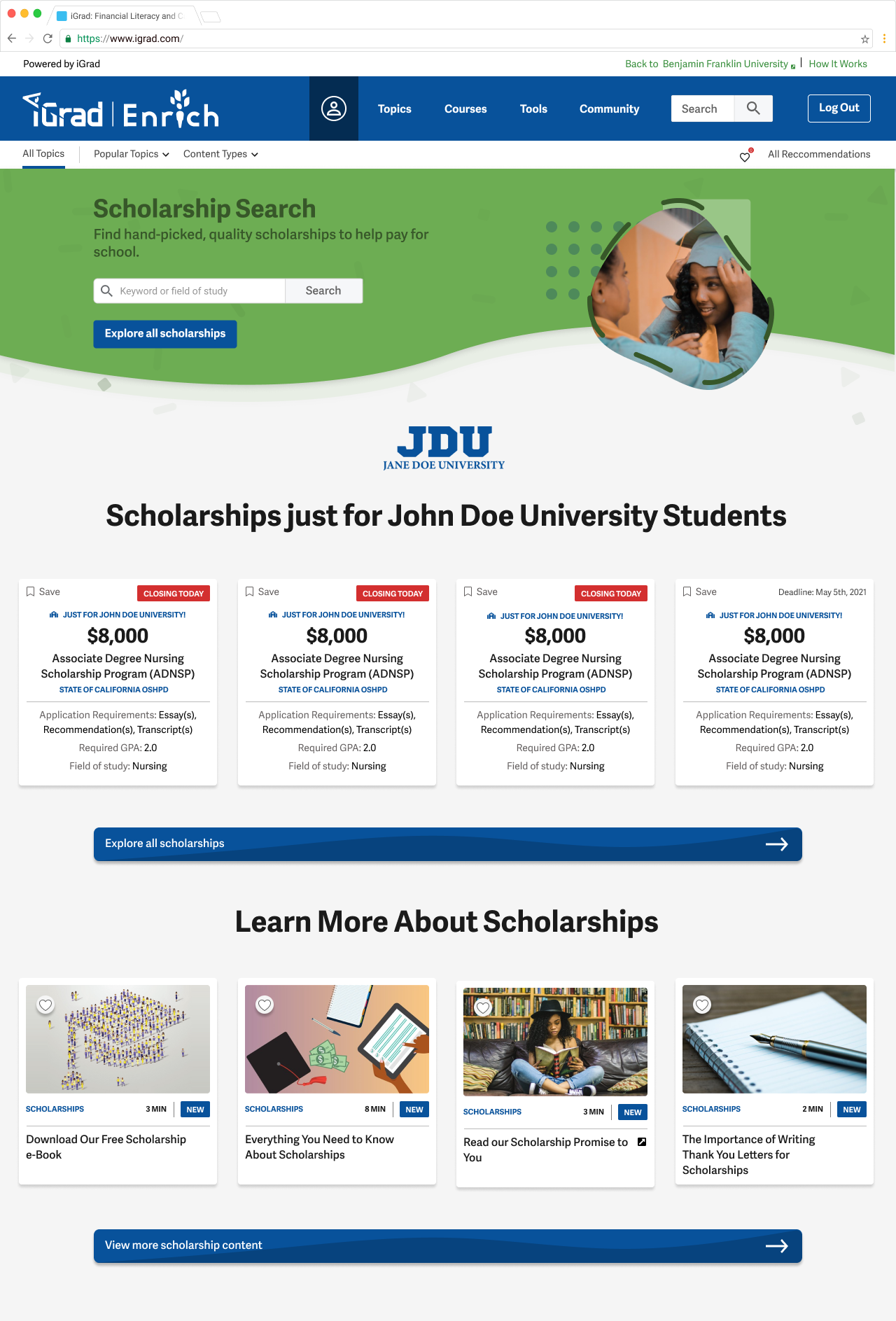
After discussing the designs with the rest of the team and reviewing with the Product Manager, we narrowed the scope of the project and made some strategic updates. At this point in the process, there are still a couple different directions that we could go and we haven't decided if we want to go with the card style or not for the main feed page. For the landing page, there are a couple different options for the buttons using two different styles from our design system. We also planned out what it might look like if a school has the "just for your school" option turned on so they can feature specific scholarships to their students. Additionally, the larger blue banner was replaced with the smaller green one from our design system in order to make a little bit more space on the page, and the scholarships card size was reduced to be the same size as our content cards elsewhere on the site.
